By the end of this guide, you’ll know what the best watercolor paints for beginners in Sri Lanka are, what to buy first (even on a tight budget), and how to choose paints that help you improve instead of fighting you.
01. If you want something affordable and easy to find [NOTE: Beginner colors which can limit some watercolor specific techniques, qualities..etc A tradeoff between Price & Quality], Camel Watercolor is a solid budget choice for practice, just know it can feel a bit flat in very smooth washes.
02. For painting, Van Gogh Watercolor is a favourite because it mixes cleanly and behaves predictably.
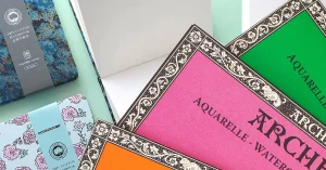
03. If you want the best balance of quality and control, Winsor & Newton Cotman is reliable and beginner-friendly. Winsor & Newton Chinese Mainland Version is Cheap and an Alternative [better pigment richness] to Camel As well.
04. And if you’re ready for stronger colour and nicer blooms, White Knight (White Nights) or Sinorus Professional are a clear step up, especially on good paper.
One tiny truth that saves money: a “better” paint won’t fix everything if your paper is struggling. If your paper pills, buckles badly, or drinks water like a biscuit… even expensive paint will look dull.
Quick 60-second test: paint one thick stroke, then paint the same colour next to it with lots of water. If that pale wash dries patchy or dusty, something, either the paint or the paper is holding you back.
What it looks like in practice: clean colour, smooth washes, less “mystery behaviour.”
Why beginners like it: it mixes predictably. You’ll waste less paint and get less mud.
If you’re painting Sri Lankan rainy skies, Van Gogh helps because your wash stays calmer even when humidity slows drying.
This one can be a good “learning set” if you’re careful.
Best for: practice pages, colour studies, quick sketches
Why it’s useful: you can learn brush control and water control without fear of wasting expensive paint
Tradeoff: some student sets can have more filler, so colours may look a bit chalky in big soft washes
If your goal is portraits or delicate florals, you might outgrow it faster. But for daily practice? It can do the job.
Cotman is a classic student-grade choice because it’s consistent. You’ll hear artists recommend it for one reason: it behaves “normally.” That matters more than people think.
Best for: a first “proper” set
Why it works: smoother gradients, clearer mixes, better layering than many cheap sets
Note: “versions” and packaging can vary by market, so focus on how it performs in your swatches rather than the label alone.
This is where you start feeling a difference.
Best for: learners who are already painting regularly and want stronger colour and nicer texture
Why it’s exciting: higher colour strength (so you don’t scrub the paper to “make it show”)
Tradeoff: stronger paints punish overworking. If you keep brushing the same area… you’ll lift paint and create rough patches.
Many artists like this because it can give beautiful granulation and deep colour without needing a huge palette.
Best for: expressive landscapes, texture lovers, people who enjoy “happy accidents” (controlled ones)
Why it’s lovely: some colours separate beautifully, especially on cotton paper
Tradeoff: if your paper is low quality, you won’t see the magic — you’ll just see backruns and uneven drying.
This is the honest budget pick.
Best for: school-level painting, daily practice, kids, beginners on a tight budget
Why it’s useful: affordable, easy to find locally
Tradeoff: colours may feel less vibrant, and smooth washes can dry a bit “dusty” depending on paper and water.
This feels wrong at first, but stick with me: choosing paint isn’t about “best brand.” It’s about best match for how you learn.
Am I practicing at least 2–3 times a week?
Am I mainly painting washes (skies, seas, backgrounds) or details (line + colour)?
Do I want “easy control” or “expressive effects”?
Your answers basically choose the paint tier for you.
Paint sets can feel like sweets in a glass jar. So many colours. So tempting. But beginners don’t need 48 colours. Honestly… it often makes things worse.
A beginner-friendly approach is a small “split primary” palette
       2 yellows (one cool, one warm)
       2 reds (one cool, one warm)
2 blues (one cool, one warm)Why? Because Sri Lankan greens (coconut leaves, paddy fields) and warm sunlight (that golden late-afternoon glow) need both cool and warm mixes. One yellow and one blue can’t do everything.
Add 1–2 earthy colours:
a warm brown (great for temple walls, tree trunks, sandy paths)
a yellow-ochre style colour (perfect for sunlit buildings and skin undertones)
60-second exercise: coconut green mix
Mix:
yellow + blue → green
Then touch a tiny bit of red/brown into it to “calm it down.”
That one tiny adjustment is the difference between “neon green” and “real Sri Lanka green.”
How to build new hues,
Mix in a palette well, not on the paper (especially when you’re learning)
Make a proper puddle (enough paint-water mix) before painting a sky wash
Keep a tissue nearby. Always.
Avoid muddy mixes;
you mix too many pigments (3–4 at once)
your brush water is dirty
you keep brushing a half-dry area
In Sri Lanka’s humidity, washes can stay damp longer… which feels helpful… until you poke it again and create blooms. You paint a wash. It looks perfect. Then… bloom city.
90-second exercise: “two-pigment rule”
Choose two colours only. Mix 3 steps: more A, equal, more B.
If that looks clean, your paint is fine — your mixing habits were the issue. (Happens to everyone.)
Troubleshooting box — If this happens → do this
Cauliflower blooms/backruns → stop touching it, let it dry, then glaze gently
Overworked area looks rough → switch to softer strokes; do fewer passes
Colours look dull → try fewer mixes, or upgrade paper before upgrading paint
Granulating pigments
These give that lovely sandy/rocky texture.
great for: old temple walls
rocky riverbeds
cloudy skies with texture
But they’re optional. Don’t buy them to “fix” a painting. Buy them when you want a specific mood.
Metallics (if available)
Nice for greeting cards, calligraphy touches, and small accents.
Not essential for learning fundamentals.
30-second exercise: texture test
Paint a wash, then drop in slightly thicker paint while it’s still wet. Watch the bloom and separation. That “moving pigment” look is the fun part of watercolor… when you’re not fighting it.
Watercolor paint is basically pigment + binder (often gum arabic) that reactivates with water. The magic is that it stays transparent, so your paper light becomes your “white paint.”
That’s why paper matters so much. Watercolor is like cooking a clear soup — if the water quality is bad, you notice.
In simple terms:
Student grade: often less pigment, more fillers, more “chalky” look in pale washes
Artist grade: more pigment, cleaner mixes, stronger colour, usually better lightfastness
Beginner-friendly doesn’t always mean “cheap.” It means the paint behaves predictably so you learn faster.
Because you’re training your eyes and hands. If the paint is fighting you, you’ll blame yourself… and your confidence drops. If the paint behaves well, you improve faster because feedback is clear: “Oh, that bloom happened because my wash was half-dry.”
Beginners
Hobbyists
Students
Professional artists
Watercolor Pans
Great for travel and quick sketching. Easy to control.
Tip for Sri Lanka: let pans dry properly before closing the box — humidity can make things stay damp and messy.
Watercolor Tubes
Best for big washes (skies, oceans, backgrounds). You can mix a generous puddle easily.
If you love painting rainy skies or paddy fields with wide gradients, tubes feel like a relief.
Liquid Watercolor
Bright and fun, often used for illustration and bold effects.
Just know: they can behave differently from traditional pans/tubes, so don’t compare them too harshly.
Watercolor Markers and Pens
Good for line + wash style. Great for urban sketching (tuk-tuks, markets, old shop signs).
But they won’t teach you classic wash control as deeply as pans/tubes.
Watercolor Pencils
Nice for detail control, then soften with water.
Helpful if your brush control feels shaky at the start.

WhatsApp us