Mixing watercolors is where painting truly begins. You can own every colour in the catalogue, but the ability to mix what you need from a limited selection of pigments gives you far more control, saves money, and produces more harmonious paintings. This guide covers everything from setting up your palette to mastering clean, vibrant mixes.
A well-organised palette is not just about neatness. Where you place your colours and how much space you leave for mixing directly affects the quality of every brushstroke. Random colour placement leads to accidental contamination, muddy mixes, and wasted time searching for the right pigment mid-painting.
Whether you use pans or tubes, the principle is the same: arrange colours logically, keep warm and cool variants accessible, and dedicate generous space for mixing.
The most practical arrangement follows the colour wheel. Place your colours in spectral order around the edge of your palette:
This arrangement means adjacent colours on your palette are already harmonious. When you need an orange, your warm yellow and warm red are right next to each other. No reaching across contaminated mixing areas.
The key to clean mixing is understanding warm and cool colour temperature. Every primary colour has a warm and cool version:
If you are building your first palette, start with these six colours. They can mix virtually any hue you need.
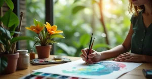
Before touching pigment, understand that water is your primary mixing tool. The ratio of water to pigment determines value (lightness/darkness), intensity, and flow. More water creates lighter, more transparent washes. Less water creates richer, more intense colour.
Always add the darker, more intense colour to the lighter one. A tiny amount of Phthalo Blue dramatically shifts a yellow mixture, but adding yellow to blue requires much more pigment to make a noticeable change. Working light to dark gives you more control and wastes less paint.
The secret to vibrant secondary colours is choosing primaries that lean toward each other:
If you mix primaries that lean away from each other (e.g., warm yellow + cool red), you get duller, more muted results. This is not a mistake – muted colours are essential for natural-looking paintings. But understanding why helps you control the outcome.
Greens are notoriously difficult. Pre-mixed greens from the tube often look artificial. Mixing your own greens from blues and yellows, then modifying with earth tones, produces far more natural results. Cool blue + cool yellow gives bright greens. Warm blue + warm yellow gives olive greens. Adding burnt sienna or raw umber creates natural foliage tones.
Grey and brown mixtures come from combining complementary colours (colours opposite each other on the colour wheel):
These mixed neutrals are far more interesting than mixing black with white. They have colour temperature, depth, and harmony built in because they contain the colours already present in your painting.
Mud happens when too many pigments combine. Here is how to avoid it:
Pigment properties directly affect mixing behaviour:
Your paint format affects the mixing experience. Tube paints squeeze out in a concentrated, creamy consistency. You can immediately mix strong, saturated colours. Pan paints require wetting and working with a brush to lift pigment, which naturally produces lighter, more diluted starting mixes.
Neither is better or worse – they simply require different approaches. Tube painters often waste paint by squeezing out too much. Pan painters sometimes struggle to achieve dark, saturated mixes because they do not lift enough pigment. Understanding this difference helps you adapt your technique.
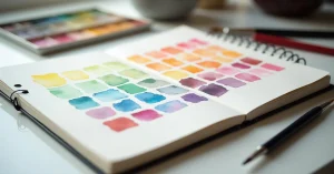
Pick any two colours from your palette. Create a grid with one colour across the top and the other down the side. Fill each cell with a graduated mix: pure colour A on one end, pure colour B on the other, with progressive mixtures between. This reveals every possible combination from just two pigments.
Find a colour in a photograph or in nature. Try to mix it using only your palette colours. This trains your eye to identify colour temperature and relative proportions. Start with: what is the dominant hue? Is it warm or cool? How saturated or muted is it?
Paint a complete scene using only three colours (one warm blue, one warm red, one cool yellow). This forces you to mix every colour you need and teaches you how much variety is possible from a tiny palette.
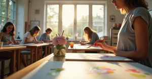
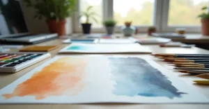
A well-set-up workspace makes mixing easier. Use a palette with large, flat mixing areas – small wells are fine for holding pigment but useless for mixing. White porcelain or plastic palettes show colour most accurately. Avoid palettes with coloured surfaces that distort your perception of the mix.
Keep two water containers: one for rinsing, one for clean water. A spray bottle helps keep palette colours moist and ready to use. Paper towels nearby allow you to blot excess water before mixing.
A six-colour split-primary palette (warm and cool versions of each primary) is sufficient for most painting. Many experienced artists work with 10-14 colours for convenience, but all secondary and tertiary colours can be mixed from six well-chosen primaries.
Mix on the palette for controlled, predictable results. Mix on the paper (wet-on-wet) for soft, spontaneous blends. Both are valid techniques – the key is choosing deliberately rather than accidentally creating mud on your paper.
Watercolors dry 20-40% lighter than they appear wet. This is normal. With practice, you will learn to mix slightly darker and more saturated than your target colour, knowing it will lighten as it dries. Testing on scrap paper first accelerates this learning.

WhatsApp us