
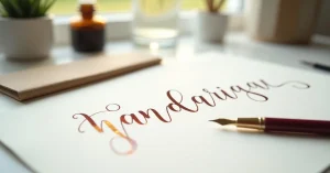
Modern calligraphy is the art of beautiful, expressive handwriting using special tools that create thick and thin strokes. Unlike traditional calligraphy, which follows strict historical scripts with rigid rules about letter forms, modern calligraphy embraces personal expression, creative freedom, and contemporary aesthetics. It blends the discipline of traditional letterforms with the spontaneity of artistic expression.
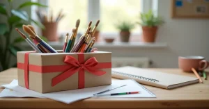
You see modern calligraphy everywhere: wedding invitations, brand logos, social media graphics, journal covers, greeting cards, envelope addressing, and art prints. Its popularity has exploded in the last decade because it is accessible, deeply satisfying, and produces beautiful results even at a beginner level.
Traditional calligraphy follows established historical scripts: Copperplate (English Roundhand), Spencerian, Italic, Gothic (Blackletter), and others. Each script has precise rules about letter proportions, stroke angles, spacing, and connections. Mastering a traditional script takes years of disciplined practice. The results are elegant, precise, and historically grounded.
Modern calligraphy uses the same tools and the same fundamental thick-and-thin contrast, but the rules are relaxed. Letters can bounce above and below the baseline. Proportions can be exaggerated for effect. Flourishes can be dramatic and expressive. The artist’s personal style is celebrated rather than suppressed.
Most modern calligraphers learn the basics of at least one traditional script first because the muscle memory and stroke understanding transfer directly. Then they relax and adapt the rules to develop their own voice.
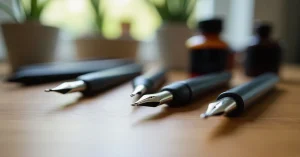
The most traditional and versatile calligraphy tool is a dip pen: a holder with a removable metal nib. When you press down on the nib, the two tines spread apart, creating a thick line. When you lift pressure, the tines close, creating a thin line. This pressure variation produces the characteristic thick-thin contrast of calligraphy.
Different nibs have different flexibility, which affects how easily they create thick strokes and how forgiving they are for beginners. Soft, flexible nibs like the Nikko G are popular starter nibs because they require less pressure to open.
Brush pens are the most popular entry point for modern calligraphy because they require no separate ink and are immediately ready to use. They have a flexible tip that creates thick downstrokes when pressed and thin upstrokes when used lightly, just like a pointed nib but without the learning curve of dip pen mechanics.
Brush pens come in different sizes: small tips for detailed lettering, medium tips for standard work, and large tips for bold display lettering. Markers like the Tombow Dual Brush Pen are widely recommended for beginners.
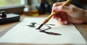
Traditional Asian calligraphy brushes create stunning letterforms with a completely different character from pointed pen calligraphy. The brush tip is incredibly responsive, creating dramatic thick-to-thin transitions and expressive, painterly strokes. These brushes connect calligraphy directly to the watercolor painting world.
For dip pens, you need a separate ink. India ink (shellac-based) is the most common. Sumi ink is preferred for brush calligraphy. For brush pens, the ink is built in. Watercolor paint can also be used for calligraphy, particularly with brush tools, creating beautiful coloured and gradient lettering effects.
Calligraphy paper should be smooth enough that nibs and brush tips glide without catching on fibres. Marker paper, laser printer paper, and dedicated calligraphy practice paper work well. For final pieces, smooth cardstock or hot press watercolor paper provides a premium surface.
All calligraphy, both traditional and modern, is built from a small set of basic strokes. Mastering these strokes before attempting full letters is essential.
Every calligraphy style shares one principle: downstrokes are thick (apply pressure) and upstrokes are thin (light pressure or lift). This creates the contrast that defines calligraphy. Practice this until it becomes automatic.
Practice each stroke on lined paper (or guidelines you have drawn) until you can produce consistent, smooth results. Fifty repetitions of each stroke is a good daily practice target.
Letters that share structural elements should be learned together:
In most modern calligraphy scripts, letters connect through thin exit strokes that flow into the entry stroke of the next letter. These connections should look natural and relaxed. Not every letter needs to connect perfectly – small lifts and breaks between letters are acceptable and can add character.
In traditional calligraphy, all letters sit neatly on the baseline. In modern calligraphy, letters can bounce, some sitting slightly above the baseline and others slightly below. This creates a playful, energetic rhythm. The key is consistency within inconsistency: the bouncing should feel deliberate, not accidental.
Flourishes are decorative extensions of strokes, usually at the beginning or end of words. A sweeping entry stroke on a capital letter, a flowing tail on a descender, or a decorative crossbar on a t. Start with simple flourishes (extended entrance and exit strokes) and progress to more complex ones as your control improves.
Modern calligraphy often mixes styles within a piece: a word in formal script next to one in casual brush lettering, or print letters mixed with cursive. This eclectic approach is a hallmark of contemporary lettering and gives you enormous creative freedom.
The most common mistake is applying pressure on upstrokes, which creates thick lines where they should be thin. Upstrokes should use almost no pressure. The pen should barely touch the paper. This feels unnatural at first but becomes instinctive with practice.
Speed kills calligraphy. Slow, deliberate strokes produce smooth, consistent results. Fast strokes produce shaky, uncontrolled lines. As you gain experience, your natural speed increases, but beginners should deliberately slow down far more than feels natural.
Even modern calligraphy benefits from baseline and x-height guidelines. Without them, letters drift up and down randomly (not the controlled bounce that looks intentional) and word spacing becomes inconsistent. Use guidelines until your muscle memory is strong enough to maintain consistent proportions without them.
Every calligraphy session should start with five minutes of basic stroke drills. This warms up your hand muscles, establishes your ink flow, and transitions your brain into the focused, meditative state that produces good lettering.
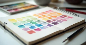
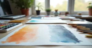
Calligraphy and watercolor painting are natural partners. Watercolor can be used directly for calligraphy by loading a brush or pointed pen with dilute paint instead of ink. This opens up possibilities for coloured lettering, gradient effects within strokes, and integrating text into painted compositions.
A Chinese calligraphy brush loaded with watercolor paint creates beautiful, expressive lettering that sits perfectly alongside watercolor illustrations. Many artists combine painted florals with brush calligraphy for greeting cards, art prints, and journaling.
If you already have a watercolor palette and brushes, you already own the tools to begin brush calligraphy. The painting skills transfer directly: brush control, water management, and colour mixing are all shared between painting and brush calligraphy.
Choose your tool (brush pen is recommended for absolute beginners) and practice the eight basic strokes. Focus only on the thick-down, thin-up principle.
Practice u, w, y, then n, m, h. Each letter multiple times, slowly and deliberately.
Practice o, a, d, g, c, e, then work through the rest of the alphabet. Do not worry about perfection. Focus on consistent thick-thin contrast.
Write a simple word like “hello” or “love” in connected script. Then write it ten more times. Compare the first and last attempts. You will see improvement even within a single session.
Modern calligraphy is a vast and growing field. Free resources include YouTube tutorials, Instagram calligraphy accounts, and printable practice worksheets. The fundamentals covered in this guide give you the foundation to explore any style that appeals to you, from elegant romantic scripts to bold brush lettering to playful bounced styles.
The most important thing is to start. Pick up a brush pen, a pencil, or even a water brush pen loaded with paint, and begin making marks. Every master calligrapher started with the same wobbly first strokes you will make. What separates them is simply more practice, more curiosity, and more joy in the process of creating beautiful letters.


WhatsApp us