
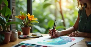
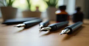
Colour mixing is the single most valuable skill in watercolor painting. A painter who can mix any colour from a small palette of primaries will always outperform someone with 48 pre-mixed colours but no mixing knowledge. The good news: the principles are simple. The practice is where it gets interesting.
This guide teaches you how to mix clean, vibrant colours and – just as importantly – how to avoid the muddy, grey mixes that frustrate every beginner.
Let us start with the biggest problem first. You mix yellow and blue expecting a vivid green, but you get a dull, grey-green instead. What happened?
The answer is almost always one of these two things:
Understanding colour bias is the key to clean mixing. Let us break it down.
The traditional colour wheel is built on three primary colours that cannot be made by mixing:
Mixing two primaries gives you three secondary colours:
Mixing a primary with an adjacent secondary gives you tertiary colours (red-orange, yellow-green, blue-violet, etc.).
This is the theory. In practice, it is more nuanced because no paint is a “pure” primary.
This is the concept that transforms your mixing. Every paint colour leans toward one side of the colour wheel or the other:
The rule for clean mixes: mix two colours that lean TOWARD each other on the colour wheel.
Based on the warm/cool bias principle, the most efficient watercolor palette is a split primary system – two versions of each primary colour, one warm and one cool:
| Primary | Warm Version | Cool Version |
|---|---|---|
| Yellow | Cadmium Yellow (or New Gamboge) | Lemon Yellow (or Hansa Yellow Light) |
| Red | Cadmium Red (or Pyrrol Scarlet) | Alizarin Crimson (or Quinacridone Rose) |
| Blue | Ultramarine Blue | Phthalo Blue (or Cerulean) |
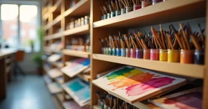
With just these 6 colours, you can mix virtually any colour on the spectrum. Add Burnt Sienna and Yellow Ochre for earth tones, and you have a complete working palette of 8 colours.
This is why the Sinours 14 pan set works well for beginners – it includes warm and cool versions of the primaries. The Winsor and Newton Cotman tubes let you build exactly this split primary palette by choosing individual colours.
You can mix colours two ways:
Both methods are valid. Palette mixing for precise colour matching; paper mixing for lively, organic effects.
The amount of water in your mix controls the value (lightness/darkness) and intensity. More water = lighter, more transparent. Less water = darker, more saturated. Watercolor’s unique quality is that your paper’s white surface provides the light – so diluting with water lets more white show through, creating luminosity.
You never need a tube of grey or black for watercolor. Mix complementary colours (opposites on the colour wheel) for beautiful, chromatic greys:
These mixed greys are far more beautiful and natural than pre-mixed grey paint, because they retain slight colour character that makes them feel alive.
Pre-mixed greens from a tube often look artificial. Mixing your own greens gives natural variety:
Practical rule: never mix more than three pigments together. Each additional pigment absorbs more light, and beyond three you almost always get mud. If you need a colour that seems to require four pigments, you are approaching it wrong – find a different combination of two or three.
Note: this applies to actual pigments, not colours. If your paint already contains two pigments (check the label), adding it to another two-pigment paint gives you four pigments in the mix. This is one reason professional single-pigment paints produce cleaner mixes.
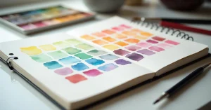
This is the most valuable exercise for any painter:
This chart becomes your personal colour mixing reference. You will discover combinations you never expected and learn exactly what your specific paints can produce.
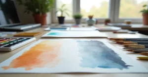
Restraint is key. A painting using 4-5 colours mixed thoughtfully looks more harmonious than one using 15 colours. Start each painting by selecting 3-4 colours maximum.
Always test your mixed colour on scrap paper of the same type before applying to your painting. Watercolor looks different wet vs. dry (it dries lighter), and palette colour looks different on paper.
Overworking wet paint on paper turns everything grey. Touch the brush to the paper, let the water carry the pigment, and stop. Less is more.
One is helpful when starting, but your own mixing chart (Exercise above) is more useful because it uses your specific paints. Generic colour wheels assume pure primaries that do not exist in real paint.
All watercolor dries lighter than it looks when wet – typically 10-20% lighter. This is normal. With practice, you learn to mix slightly stronger than your target value.
Both approaches work. Convenience colours save time for frequently used mixes. But understanding mixing means you can create any colour with a minimal palette. Start by mixing everything to build understanding, then add convenience colours for your most-used hues.
Colour mixing is a skill that improves with every painting session. Start with the split primary palette, make your colour chart, and practice mixing clean secondaries. For the theory behind all of this, read our guide on how watercolor paint works. And make sure you are mixing on a quality palette – the white surface matters for seeing true colour.


WhatsApp us