
The texture of your watercolor paper changes how every technique performs. The same brush loaded with the same paint produces noticeably different results on cold press versus hot press versus rough paper. Understanding these differences lets you choose paper that supports your painting style rather than fighting it.
This guide examines how each paper texture interacts with the core watercolor techniques, helping you make informed paper choices for different types of work.
Watercolor paper comes in three standard textures, created during manufacturing by the pressing process:
Flat washes on hot press paper are the hardest to control. Paint sits on the smooth surface and moves freely – any tilt of the paper, any pause in brushwork, and the paint redistributes. Achieving a perfectly even flat wash requires skilled brush handling and consistent speed. However, when executed well, hot press produces the smoothest, most even washes of any texture.
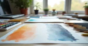
Cold press is the most forgiving for washes. The moderate texture grabs and holds paint, slowing its movement across the surface. This gives you more working time and more control. Minor inconsistencies in brushwork are hidden by the texture – the paper does some of the blending work for you.
Washes on rough paper have a natural, textured appearance. The deep valleys collect pigment while the peaks may remain lighter, creating a subtle, granulated effect even with non-granulating pigments. Perfectly smooth flat washes are difficult on rough paper, but the organic, textured quality is often desirable for landscapes and natural subjects.
Wet-on-wet on hot press is unpredictable. Water flows freely in all directions with little resistance from the surface. Blooms and backruns form quickly because the smooth surface offers no friction to slow paint movement. For painters who enjoy spontaneous, dynamic effects, this can be exciting. For those seeking controlled soft blends, it is challenging.
The moderate texture adds gentle resistance to paint flow, producing controlled yet beautiful soft edges and blends. Wet-on-wet behaves predictably on cold press – colours diffuse softly but do not run completely out of control. This is why cold press is recommended for beginners learning wet-on-wet.
Rough paper slows paint movement significantly. Wet-on-wet blends are gentler, with colour staying closer to where it was placed. The deep texture can create interesting granulation effects as pigment settles into the valleys. Wet-on-wet on rough paper is more controlled but requires more paint because the texture absorbs more moisture.
Wet-on-dry on hot press produces the sharpest edges possible. Every brushstroke dries with a crisp, defined edge. For botanical illustration, detailed architectural painting, and any subject requiring precision, hot press is unmatched.
Edges are slightly softer than hot press due to the texture, but still clearly defined. Cold press handles wet-on-dry beautifully for most purposes. The slight texture adds visual interest to otherwise flat colour areas.
Wet-on-dry edges are rougher and more irregular on rough paper. The peaks of the paper texture break up crisp lines, creating a more organic, hand-made feel. Fine detail work is limited because the texture prevents smooth, continuous fine lines.
Dry brush is minimally effective on hot press. The smooth surface means the brush contacts the paper uniformly – there are no peaks to catch the bristles and no valleys to skip over. The result is a scratchy, dry mark rather than the textured, broken strokes that define the technique.
Cold press provides good dry brush effects. The moderate texture creates broken strokes with appealing texture – enough to suggest surfaces like stone, bark, and rough water without being overly dramatic.
Rough paper is where dry brush truly shines. The pronounced peaks catch the bristles while the deep valleys remain untouched, creating dramatic, textured marks with maximum white-paper-to-paint contrast. For landscape painters who rely on dry brush for rocks, trees, and natural textures, rough paper is the ideal surface.
The clear winner for detail. Smooth paper allows the brush tip to glide continuously, producing thin, consistent lines. Tiny details, cross-hatching, and intricate patterns render cleanly. Botanical artists, illustrators, and calligraphers prefer hot press for this reason.
Good for moderate detail. Fine lines are possible but may appear slightly textured at close range. For most painting purposes (as opposed to illustration), this level of detail is more than sufficient.
Poor for fine detail. The texture breaks up thin lines, making them appear ragged. Small shapes fill unevenly as paint pools in the valleys. Rough paper is designed for broad, expressive work, not precision.
Lifting is generally easier on hot press because paint sits more on the surface than in texture valleys. A damp brush can re-dissolve and remove colour effectively. However, staining pigments still resist lifting regardless of paper surface.
Moderate lifting ability. Paint in the texture valleys is slightly harder to reach, but overall lifting performance is good, especially on cotton cold press paper. Most artists find cold press sufficient for occasional corrections.
Lifting from rough paper is the most difficult. Pigment settles deep into the pronounced valleys and resists removal. The rough surface also makes scrubbing more likely to damage the paper. If you work in a style that requires frequent corrections, rough paper is not ideal.
Granulating pigments (like ultramarine blue, cobalt, burnt sienna) show minimal granulation on hot press. The smooth surface has no valleys for pigment particles to settle into, so the characteristic speckled appearance is reduced or absent.
Granulation shows beautifully on cold press. The moderate texture provides just enough surface variation for heavy pigment particles to separate and settle naturally, creating the speckled effect that many painters value.
Maximum granulation effect. The deep valleys collect heavy pigment particles dramatically, creating bold, textured patterns. If you love granulating pigments, rough paper amplifies their natural behaviour.
| Technique | Hot Press | Cold Press | Rough |
|---|---|---|---|
| Flat wash | Difficult (but smoothest result) | Easy and forgiving | Textured result |
| Wet-on-wet | Unpredictable, dynamic | Controlled, beautiful | Gentle, granulated |
| Wet-on-dry | Sharpest edges | Clean edges with texture | Organic edges |
| Dry brush | Minimal effect | Good texture | Maximum texture |
| Fine detail | Excellent | Good | Limited |
| Lifting | Easiest | Good | Difficult |
| Granulation | Subdued | Beautiful | Dramatic |
Texture and weight work together. Heavier paper (300gsm+) tends to have more pronounced texture within each category. A 300gsm cold press has noticeably more tooth than a 200gsm cold press from the same brand. If you like cold press but want more texture, going heavier weight may be enough without switching to rough.
Cotton paper also tends to have slightly more pronounced texture than cellulose paper at the same weight and press type. A cotton cold press like Baohong Academy feels different from a cellulose cold press of the same weight.
Before committing to a large painting, test your planned techniques on a scrap piece of the same paper. Paint a small section with each technique you plan to use: a flat wash, some wet-on-wet blending, a few dry brush strokes, and some detail work. In five minutes, you will know how the paper handles your intended approach. This is especially important when trying a new paper or texture for the first time.
You paint on one sheet, so you work with one texture per painting. However, you can vary technique to simulate different textures – smooth washes for sky, dry brush for rocks. The paper provides a consistent base that your techniques work against.
Both matter. Cold press from Brand A may feel different from cold press from Brand B – the pressing process, fibre composition, and sizing vary. Within a brand, the texture choice has the larger impact on technique performance. Between brands, paper quality (cotton vs cellulose, sizing quality, weight) matters more.
Cold press is by far the most popular among professionals. It offers the best balance of forgiveness, technique versatility, and visual interest. Hot press and rough are specialist choices for specific styles or subjects.


WhatsApp us