
Green is the colour that watercolorists struggle with most. The greens that come straight from the tube or pan often look artificial – too vivid, too uniform, and nothing like the complex, varied greens found in nature. The solution is learning to mix your own greens from blues, yellows, and earth tones. Mixed greens are more natural, more varied, and can be tuned to match any green you see in the landscape.
A single tube green (sap green, viridian, hooker’s green) produces one consistent green. Nature never shows one green. A single tree might display warm yellow-greens where sunlight hits, cool blue-greens in shadow, dark olive greens in the deepest shade, and bright lime greens on new growth. Using one tube green for all of these produces flat, unconvincing foliage.
Some tube greens, especially phthalo green, are extremely intense – far more vivid than any green found in nature. Painting foliage with undiluted phthalo green produces neon results that look cartoonish rather than natural.
Every green mix starts with a blue and a yellow. The specific blue and yellow you choose determines the character of the resulting green. Understanding this is core colour mixing knowledge.
Phthalo Blue + Lemon Yellow (more yellow than blue)
The most vivid, lively green. Use for sunlit new leaves, grass in direct light, and tropical foliage. Mix with heavy yellow bias and just a touch of phthalo blue (phthalo is very powerful).
Ultramarine Blue + New Gamboge (equal parts, leaning blue)
A deep, warm green suitable for mature foliage, dense forest, and mid-tones in landscape painting. The ultramarine’s granulation adds natural texture.
Phthalo Blue + Lemon Yellow + touch of Burnt Sienna
Start with a bright green from phthalo and lemon, then add a small touch of burnt sienna to darken and mute it. The result is a cool, deep shadow green that reads naturally as shade.
Ultramarine Blue + Yellow Ochre
A muted, warm green that appears constantly in nature. Dead leaves, dry grass, lichen on stone, autumn foliage in shadow. One of the most useful landscape greens.
Cerulean Blue + New Gamboge
A gentle, warm green with subtle granulation. Feels like sunlight filtering through leaves. Useful for highlights on foliage.
Phthalo Blue + Burnt Sienna (heavy on the blue)
Not a pure green but a very dark green-black useful for the darkest darks in foliage. Dense shadows under trees, evergreens at distance, dark water reflections.
Ultramarine Blue + Yellow Ochre + touch of Quinacridone Rose
A grey-green with a subtle lavender twist. Beautiful for silvery foliage like eucalyptus, sage, and olive trees.
The quickest way to make any green look more natural is to add its complementary colour (red or red-orange). According to colour theory, mixing complementary colours neutralises intensity:
Start with the smallest possible addition of the muting colour. It is much easier to mute more than to un-mute a green that has gone too grey.
A single tree requires 3-5 different greens used simultaneously:
Apply these greens wet-on-wet using the wet-on-wet technique for natural blending, or wet-on-dry for more defined leaf clusters.
Grass is warmer and more yellow-green in full sun, cooler and bluer in overcast light. Dry grass shifts to yellow ochre and raw sienna territory – mixing these warm earth tones with a tiny amount of blue produces the subtle warm greens of dried meadows.
Green reflections in water are muted and darker than the foliage above. Take your foliage mix and add more blue plus a touch of earth tone. The reflection should be cooler and less vivid.
Due to atmospheric perspective, distant greens are cooler, bluer, and less vivid than foreground greens. Use cerulean blue or ultramarine with very little yellow, muted with a touch of quinacridone rose, for the blue-green of distant hills and tree lines.
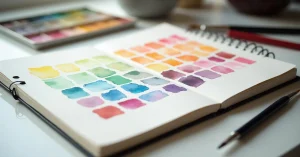
This is the single most useful exercise for mastering green mixing:
This chart gives you 12+ distinct greens you can reproduce consistently. Tape it to your studio wall and reference it when painting. Over time, you will reach for the right combination instinctively.
Even if you mix a beautiful green, using the same mix everywhere creates flat, monotonous foliage. Vary your mix constantly – adjust the blue-to-yellow ratio, add more or less earth tone, shift warm to cool.
Phthalo blue is extremely powerful. A tiny amount goes a long way. New painters often add too much, creating greens that are far more intense than anything in nature. Start with a yellow-heavy mix and add phthalo in drops.
Natural greens are warm in light and cool in shadow. Painting all greens at the same temperature (all warm or all cool) removes the depth that temperature variation creates. Consciously shift your mixes warmer for lit areas and cooler for shadowed ones.
Having one transparent green (like sap green or viridian) is convenient as a starting point that you then modify by adding blue, yellow, or earth tone. It saves mixing time while still allowing customisation. But you should be able to mix every green you need without it.
You are likely mixing too many pigments together or using opaque colours. Stick to two-pigment mixes where possible (one blue + one yellow). Add a muting colour only as a third component and in small amounts. Using transparent pigments keeps greens clean and luminous.
At minimum 3-4 distinct greens: a warm light green, a mid-tone, a cool dark, and a very dark shadow green. Professional landscape painters use 6-10 greens or more in a single painting, adjusting every mix slightly as they paint.


WhatsApp us