
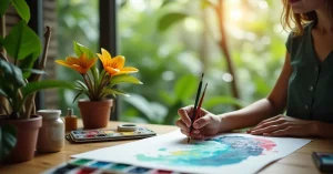
Loose floral watercolor painting is one of the most popular and accessible styles in the medium. Unlike botanical illustration, which demands precise detail, loose florals celebrate watercolor’s natural tendency to flow, blend, and surprise. The best loose florals look effortless – soft petals bleeding into one another, leaves that are suggested rather than drawn, and compositions that feel fresh and alive.
The truth is that even loose painting requires technique and practice. But the learning curve is gentle, the results are rewarding from day one, and the style is endlessly adaptable. In this tutorial, we will paint a simple loose floral composition using techniques any beginner can master.
Florals benefit from certain material choices:
Before painting a full flower, practice individual petal strokes. Load your medium round brush with paint and press it against the paper, starting at the tip. Press down to widen the stroke, then lift gradually to taper. This single stroke creates a convincing petal shape.
Hold your brush at about 45 degrees to the paper. Touch the tip down lightly, gradually increase pressure as you pull the stroke, then decrease pressure and lift off. The shape goes from thin to thick to thin – exactly like a natural petal. Practice this stroke 20 times before touching your painting.
Real petals curve and overlap. Instead of straight strokes, arc your wrist as you pull the brush. A gentle C-curve or S-curve creates petals that look like they are opening or folding naturally. The direction of curve varies by petal position – outer petals curve outward, inner petals curve inward.
We will start with the simplest flower type before moving to roses.
Mix two variations of your petal colour. For pink flowers: a saturated warm pink and a diluted lighter version of the same. Having two values ready before you paint means you can create variation within petals.
Load your brush with the lighter pink mix. Make a press-and-lift petal stroke, curving slightly. This is your first petal. It should be about 2 to 3 centimetres long depending on the size of flower you want.
While the first petal is still wet, paint the next petal right next to it. Let the wet edges touch. Where they meet, the colours will bleed and merge slightly, creating a natural-looking join between petals. This wet-on-wet bleeding is what gives loose florals their characteristic softness.
Continue around in a circle, adding five petals that all point toward a common centre. Leave a tiny gap in the middle for the flower centre.
While the petals are still damp, take your more saturated pink mix and touch it into the centre area of the flower and at the base of each petal. The darker colour will spread outward into the wet petals, creating a natural gradient from dark centre to lighter tips. This happens automatically – you do not need to blend manually.
Once the petals have started to dry (they should still be slightly damp), dot a tiny amount of concentrated Cadmium Yellow into the very centre. The yellow will spread slightly into the pink, creating a warm glow at the heart of the flower.
Roses are the most popular subject in loose watercolor florals. Despite looking complex, a loose rose follows a simple inside-out approach.
Using a concentrated pink mix, paint a small irregular C-shape in the centre of where your rose will be. Add another C-shape next to it, facing the opposite direction. These two small curves suggest the tightly furled inner petals of a rose. Do not make them too neat – slight irregularity looks more natural.
While the centre is still wet, begin adding larger petal strokes radiating outward. Use the press-and-lift stroke, curving each petal around the centre. Each successive ring of petals should be slightly larger and slightly lighter (add a touch more water to your mix as you work outward).
Leave small gaps between some petals. You do not need to fill every space. These gaps let white paper peek through, adding sparkle and preventing the rose from looking like a solid blob of colour.
As you add outer petals, introduce colour variation. Drop a touch of Alizarin Crimson into some petals for depth. Add extra water to others for near-transparent, ethereal petals. For the outermost petals, try a very dilute wash that barely tints the paper. This graduation from intense centre to whisper-light outer petals mimics how real roses look.
Let the rose dry almost completely. If any area looks too uniform, you can add a wet-on-dry accent of concentrated dark pink at the very centre for added depth. But restrain yourself – the biggest mistake with loose florals is overworking them.
Leaves provide essential contrast and structure to floral compositions. Like petals, loose leaves are painted with simple brush strokes rather than detailed drawing.
Load your medium brush with Sap Green. Touch the tip down, press to widen, then lift and draw the stroke to a point. One stroke creates one leaf. The shape naturally tapers at both ends, which is exactly how most leaves look.
Never paint all leaves the same green. Mix warm greens (more yellow), cool greens (more blue), and dark greens (add Burnt Sienna or Ultramarine Blue). Varying your greens is the single most important thing you can do to make foliage look natural and alive rather than flat and monochrome.
Use your small brush with a dark green or brown mix. Paint stems with single confident strokes, starting from the flower and pulling downward. Stems should curve naturally, not stand rigidly straight. Add small leaves branching off the main stem at varied angles.
For particularly loose leaves, paint the leaf shape with one green, then immediately drop a different green or a touch of Burnt Sienna into the wet shape. The colours merge and create a beautiful, natural-looking variation within a single leaf.
For a balanced floral composition, arrange your main flowers in a rough triangle. Place your largest, most detailed flower at one point, a medium bloom at another, and a smaller bud at the third. This creates visual balance without symmetry.
Paint the largest flowers first, let them dry, then add smaller flowers and green elements around them. This layering prevents colours from bleeding unintentionally between separate flowers. The glazing approach works perfectly here – each element is painted on a dry layer beneath.
Once your main flowers and leaves are placed, fill gaps with small elements: tiny buds (a simple dot of concentrated colour), filler leaves (quick single strokes), and the occasional wispy stem. These supporting elements tie the composition together without competing with the main blooms.
Resist the urge to fill every blank area. White space in a loose floral composition is like silence in music – it gives the eye a place to rest and makes the painted elements more impactful. Some of the most beautiful loose florals have as much white paper showing as painted area.
Quinacridone Rose as the main petal colour, Alizarin Crimson for depth, New Gamboge for warm centres, Sap Green plus Burnt Sienna for varied foliage.
Cadmium Yellow and Cadmium Orange for petals, Burnt Sienna for shadows and depth, Sap Green darkened with Ultramarine for cool-toned autumn leaves.
Ultramarine Blue with touches of Quinacridone Rose for blue-violet petals, a touch of Cadmium Yellow for centres, cool blue-greens for foliage.
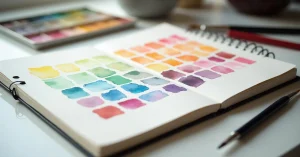
The best colour mixing approach for florals uses a limited palette of three to five colours, mixed in multiple variations rather than using many different tube colours.
Once you have placed a petal stroke, leave it alone. Going back into a drying petal to adjust it creates muddy, overworked patches. If a petal is not quite right, let it dry completely and add a corrective glaze later.
Flowers in real life have enormous colour variation. Each petal catches light differently, and colours shift from warm to cool, light to dark. Painting every petal the same colour from the same mix produces flat, artificial-looking flowers.
Perfectly round, perfectly symmetrical flowers look more like diagrams than paintings. Intentionally vary your petal sizes, shapes, and positions. Let some petals overlap. Let some be half-hidden behind others. Imperfection is what makes loose florals look alive.
Once you are comfortable painting individual flowers and simple arrangements, challenge yourself with more complex compositions. Try painting from a real flower arrangement. Practice different flower types: dahlias, peonies, wild flowers, tropical blooms. Experiment with backgrounds, adding wet-on-wet colour washes behind your flowers for a more finished look.
The more you practice loose florals, the more intuitive the brush strokes become. What starts as conscious press-and-lift technique eventually becomes a natural, flowing movement that produces beautiful results almost without thinking. That is when loose floral painting becomes truly joyful.

WhatsApp us