
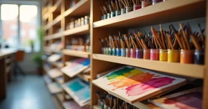
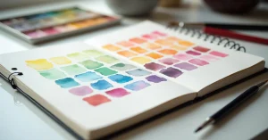
Every watercolor pigment has a personality. Some are transparent and glow when layered. Others are granulating and settle into the texture of your paper, creating speckled effects. Some stain permanently while others lift out easily for corrections. Understanding these properties transforms your colour choices from guesswork into informed decisions.
This guide explains the five key pigment properties that every watercolorist should understand. These properties are especially important when you move beyond student-grade paints into professional colours, where each pigment’s characteristics become more pronounced.
Lightfastness is a pigment’s resistance to fading when exposed to light over time. A highly lightfast pigment retains its colour for decades or centuries, while a fugitive pigment fades visibly within months to years of light exposure.
If you display your paintings on walls, sell your work, or create pieces you want to preserve, lightfastness determines whether your colours will look the same in five years as they do today. A painting made entirely with lightfast pigments will maintain its original appearance for generations. A painting with fugitive pigments will slowly lose colour intensity, especially in areas exposed to direct or indirect sunlight.
Most paint manufacturers rate lightfastness using the ASTM (American Society for Testing and Materials) scale:
Professional-grade paints like Winsor and Newton Cotman label lightfastness ratings on every tube and pan. Student-grade paints like the Sinours pan set often do not specify ratings, which typically means mixed lightfastness across the set.
For paintings you plan to display or sell, use only ASTM I and II rated pigments. For practice, studies, and experimentation, lightfastness is less important – use whatever colours help you learn. Always store finished paintings away from direct sunlight regardless of pigment quality.
Transparency describes how much light passes through a layer of dried paint to the paper beneath. A transparent pigment allows the white of the paper to shine through, creating luminous, glowing colour. An opaque pigment blocks light, creating solid, dense coverage.
The signature beauty of watercolor painting comes from transparency. When transparent pigment is layered over white paper, light travels through the paint layer, bounces off the white paper, and travels back through the paint to your eye. This double-pass through the colour layer creates a luminous glow that is unique to watercolor and impossible to achieve with opaque media.
This is why colour theory in watercolor emphasises working from light to dark. Each successive transparent layer deepens the colour while maintaining luminosity. Opaque colours laid over other colours simply cover the underlying layer, losing the characteristic watercolor glow.
Glazing – applying thin, transparent layers over dried paint – is one of the most powerful techniques in watercolor. Understanding transparency tells you which colours work for glazing and which do not. A transparent quinacridone red glazed over a dry yellow wash creates a beautiful, luminous orange. An opaque cadmium red applied the same way creates a flat, dull layer that hides the yellow.
For colour mixing on paper through glazing, use transparent pigments exclusively. Save opaque colours for direct application where you want solid coverage.
Granulation is the tendency of certain pigments to settle into the valleys and texture of the paper rather than lying uniformly across the surface. Granulating pigments create a natural, speckled appearance as the heavier pigment particles sink into the paper’s tooth while lighter particles rest on the peaks.
A granulating wash looks textured and alive – almost like viewing the colour through a very fine screen or mesh. A non-granulating wash appears smooth and uniform. The effect is more pronounced on textured cold press and rough paper than on smooth hot press paper.
Granulation is a tool, not a flaw. Landscape painters use granulating pigments to suggest natural textures – stone, sand, rough water, weathered surfaces. The speckled effect adds visual interest without any additional brushwork. Portrait painters often prefer non-granulating pigments for smooth skin tones. Understanding which of your pigments granulate lets you make deliberate choices about texture in your paintings.
Staining pigments bond chemically to the paper fibres, making them difficult or impossible to lift (remove) once dry. Non-staining pigments sit on top of the paper surface and can be partially or fully removed with a damp brush, sponge, or tissue.
These penetrate paper fibres permanently. Even scrubbing with a wet brush after drying leaves visible colour:
These can be partially or fully removed even after drying:
If your painting approach relies on correcting mistakes, softening edges, or lifting out highlights from dried paint, non-staining pigments give you that flexibility. This is particularly important on cotton paper where lifting capability is a major advantage.
Staining pigments are not inferior – they produce intense, vibrant colours and are excellent where you want permanence. But using a highly staining pigment in an area where you might want to make corrections is risky. Experienced painters choose staining pigments intentionally for areas of definite, committed colour.
Paint labels list the pigments used in their formulation using Colour Index names (e.g., PB29 for ultramarine blue, PY150 for a specific yellow). Single-pigment paints contain one pigment. Multi-pigment paints (also called convenience mixes or hues) blend two or more pigments together.
When you mix two single-pigment paints on your palette, you have two pigments interacting. The resulting colour is clean and predictable. When you mix two multi-pigment paints, you might have four, five, or six pigments interacting. More pigments in a mix means more light wavelengths are absorbed, which produces muddier, less vibrant colour. This is why clean colour mixing is easier with single-pigment paints.
Pre-mixed convenience colours are useful when used directly from the pan or tube without further mixing. A multi-pigment green used as-is for foliage looks perfectly fine. The muddiness issue only arises when you mix that green with another colour that adds more pigments to the equation.
Budget sets like the Sinours 14 pan set contain mainly convenience mixes. This is perfectly acceptable for learning and casual painting. As you advance and build a custom palette, prioritising single-pigment paints gives you better mixing control.
Professional watercolor labels contain coded information about every property discussed above:
| Label Element | What It Tells You | Example |
|---|---|---|
| Colour Index Name | The specific pigment used | PB29 = ultramarine blue |
| Lightfastness | Resistance to fading | ASTM I = excellent |
| Transparency | How much light passes through | T = transparent, O = opaque |
| Staining | How permanent it is | St = staining, NSt = non-staining |
| Granulation | Whether it creates speckled effects | G = granulating, NG = non-granulating |
| Series number | Price tier (more expensive pigments = higher series) | Series 1-5 |
A well-designed palette includes a mix of properties for maximum versatility:
On mixing colours using colour theory principles, understanding which pigments are transparent and which granulate helps you predict how mixes will look before you apply them to your painting.
Student-grade paints use less pure pigmentation and more fillers, which mutes all these properties. Transparency is reduced, granulation is softer, and staining/lifting behaviour is less distinct. The properties become clearer and more useful as you move to professional-grade paints.
No. Granulation is a natural characteristic of certain mineral pigments. Many professional watercolorists deliberately choose granulating pigments for specific effects. It is a tool, not a defect.
Dilution affects the apparent transparency. A very diluted wash of an opaque pigment appears more transparent. However, the inherent transparency of the pigment itself is fixed – you cannot make cadmium yellow behave like a transparent pigment through dilution alone.
Watercolor always dries lighter than it appears when wet. This is because wet paint has a glossy surface that reflects light differently. The degree of lightening varies by pigment – some shift dramatically while others change minimally. With experience, you learn to compensate by mixing slightly darker than your target value.


WhatsApp us